文章写作参考手册
本文在收集及完善过程中参考了多位大佬及部分网页的相关内容,可点击如下链接进行查看,如未在以下链接,会在文中标明

 Butterfly官方站Butterfly官网标签外挂(Tag-Plugins)说明
 AkilarTag-Plugins-Plus
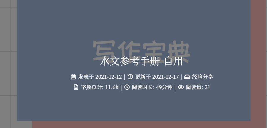
 Gahotx水文参考手册-自用
 小康博客小康的Butterfly主题使用文档
Markdown
Markdown是一种轻量级标记语言,排版语法简洁,让人们更多地关注内容本身而非排版。它使用易读易写的纯文本格式编写文档,可与HTML混编,可导出 HTML、PDF 以及本身的 .md 格式的文件。因简洁、高效、易读、易写,Markdown被大量使用,如果你想参考官方文档,可点击这里Markdown 官方教程
本文还参考了younghz的Github仓库,可点击这里Markdown 基本语法
标题
1 | # 一级标题 |
换行
这是一条换行的测试,从此处 <br>换行
1 | 这是一条换行的测试,从此处<br>换行 |
区块引用
区块引用
嵌套引用
1 | > 区块引用 |
代码块
C++代码示例
1 | void main() |
´´´cpp
void main()
{
printf(“Hello, Markdown.”);
}
´´´
强调
斜体 斜体
粗体 粗体
1 | _斜体_ *斜体* |
列表
使用
+、-标记无序列表,如:- 列表
- 列表
有序列表的标记方式是将上述的符号换成数字,并辅以
.,如:- 第一项
- 第二项
- 第三项
1 | 无序列表: |
分割线
分割线最常使用就是三个 -,但是前后要空行
1 |
|
链接
链接可以由两种形式生成:行内式和参考式
行内式:
Markdown 官方教程
Markdown 官方教程
参考式:
Markdown 官方教程1
Markdown 官方教程2
1 | 行内式: |
图片
添加图片的形式和链接相似,只需在链接的基础上前方加一个 !
使用markdown原生语法插入图片时,调整不太好调整,一般采用html标签插入标签,可点击 <a href=" #html-img">这里 </a>

1 |  |
表格
用 |表示表格纵向边界,表头和表内容用 -隔开,并可用 :进行对齐设置,两边都有 :则表示居中,若不加 :则默认左对齐
| 1 | 2 | 3 |
|---|---|---|
| 4 | 5 | 6 |
| 7 | 8 | 9 |
1 | 1 | 2 | 3 |
标记
ctrl+a
1 | `ctrl+a` |
反斜杠 \
相当于反转义作用,使符号成为普通符号
**粗体失效**
1 | \*\*粗体失效\*\* |
标签外挂(Tag Plugins)
标签外挂是 Hexo 独有的功能,并不是标准的 Markdown 格式。
以下的写法,只适用于 Butterfly 主题,用在其它主题上不会有效果,甚至可能会报错。使用前请留意
如果你想查看更全面更权威的说明,请点击这里Tag Plugins
引用 Note (Bootstrap Callout)
修改主题配置文件
1 | note: |
Note标签外挂有两种用法,icons和 light_bg_offset只对方法一生效
Note 标签外挂有两种用法
1 | {% note [class] [no-icon] [style] %} |
| 名称 | 用法 |
|---|---|
| class | 【可选】标识,不同的标识有不同的配色 <br>( default / primary / success / info / warning / danger ) |
| no-icon | 【可选】不显示 icon |
| style | 【可选】可以覆盖配置中的 style <br>(simple/modern/flat/disabled) |
默认 提示块标签
default 提示块标签
primary 提示块标签
success 提示块标签
info 提示块标签
warning 提示块标签
danger 提示块标签
默认 提示块标签
default 提示块标签
primary 提示块标签
success 提示块标签
info 提示块标签
warning 提示块标签
danger 提示块标签
默认 提示块标签
default 提示块标签
primary 提示块标签
success 提示块标签
info 提示块标签
warning 提示块标签
danger 提示块标签
默认 提示块标签
default 提示块标签
primary 提示块标签
success 提示块标签
info 提示块标签
warning 提示块标签
danger 提示块标签
1 | {% note simple %}默认 提示块标签{% endnote %} |
1 | {% note modern %}默认 提示块标签{% endnote %} |
1 | {% note flat %}默认 提示块标签{% endnote %} |
1 | {% note disabled %}默认 提示块标签{% endnote %} |
1 | {% note no-icon %}默认 提示块标签{% endnote %} |
1 | {% note [color] [icon] [style] %} |
| 名称 | 用法 |
|---|---|
| color | 【可选】颜色 <br>(default / blue / pink / red / purple / orange / green) |
| icon | 【可选】可配置自定义 icon (只支持 fontawesome 图标, 也可以配置 no-icon ) |
| style | 【可选】可以覆盖配置中的 style <br>(simple/modern/flat/disabled) |
你是刷 Visa 还是 UnionPay
2021 年快到了….
小心开车 安全至上
这是三片呢?还是四片?
你是刷 Visa 还是 UnionPay
剪刀石头布
前端最讨厌的浏览器
你是刷 Visa 还是 UnionPay
2021 年快到了….
小心开车 安全至上
这是三片呢?还是四片?
你是刷 Visa 还是 UnionPay
剪刀石头布
前端最讨厌的浏览器
你是刷 Visa 还是 UnionPay
2021 年快到了….
小心开车 安全至上
这是三片呢?还是四片?
你是刷 Visa 还是 UnionPay
剪刀石头布
前端最讨厌的浏览器
你是刷 Visa 还是 UnionPay
2021 年快到了….
小心开车 安全至上
这是三片呢?还是四片?
你是刷 Visa 还是 UnionPay
剪刀石头布
前端最讨厌的浏览器
1 | {% note 'fab fa-cc-visa' simple %}你是刷 Visa 还是 UnionPay{% endnote %} |
1 | {% note 'fab fa-cc-visa' modern %}你是刷 Visa 还是 UnionPay{% endnote %} |
1 | {% note 'fab fa-cc-visa' flat %}你是刷 Visa 还是 UnionPay{% endnote %} |
1 | {% note 'fab fa-cc-visa' disabled %}你是刷 Visa 还是 UnionPay{% endnote %} |
1 | {% note no-icon %}你是刷 Visa 还是 UnionPay{% endnote %} |
Gallery 相册图库
1 | <div class="gallery-group-main"> |
- name:图库名字
- description:图库描述
- link:连接到对应相册的地址
- img-url:图库封面的地址


1 | <div class="gallery-group-main"> |
Gallery 相册
区别于旧版的 Gallery 相册,新的 Gallery 相册会自动根据图片长度进行排版,书写也更加方便,与 markdown 格式一样。可根据需要插入到相应的 md
1 | {% gallery %} |
gallerygroup图库 和 gallery 相册页建立连接:
- 在 [Blogroot]/source/gallery/ 下面建立相册页文件夹,并加入相册页index.md
- 在[Blogroot]/source/gallery/index.md 图库链接中加入相应文件夹的路径


1 | {% gallery %} |
Tag-hide
请注意,Tag-hide 内的标签外挂 content 内都不建议有 h1 - h6 等标题。因为 Toc 会把隐藏内容标题也显示出来,而且当滚动屏幕时,如果隐藏内容没有显示出来,会导致 Toc 的滚动出现异常
如果你想把一些文字、内容隐藏起来,并提供按钮让用户点击显示,可以使用这个标签外挂
inline 在文本里面添加按钮隐藏内容,只限文字
( content不能包含英文逗号,可用 ‚)
1 | {% hideInline content,display,bg,color %} |
- content: 文本内容
- display: 按钮显示的文字(可选)
- bg: 按钮的背景颜色(可选)
- color: 按钮文字的颜色(可选)
世界上最帅的人是谁?
1 | 世界上最帅的人是谁? {% hideInline 当然是我啦,哈哈,查看答案,#FF7242,#fff %} |
block独立的block隐藏内容,可以隐藏很多内容,包括图片,代码块等等
( display不能包含英文逗号,可用 ‚)
1 | {% hideBlock display,bg,color %} |
- content: 文本内容
- display: 按钮显示的文字(可选)
- bg: 按钮的背景颜色(可选)
- color: 按钮文字的颜色(可选)
查看答案
1 | 查看答案 |
如果你需要展示的内容太多,可以把它隐藏在收缩框里,需要时再把它展开
( display不能包含英文逗号,可用 ‚)
1 | {% hideToggle display,bg,color %} |
- content: 文本内容
- display: 按钮显示的文字(可选)
- bg: 按钮的背景颜色(可选)
- color: 按钮文字的颜色(可选)
1 | {% hideToggle Butterfly安装方法 %} |
Tabs
Butterfly的 tab标签和 Volantis的 tab标签都是移值自 NexT主题,所以写法和效果一模一样
1 | {% tabs Unique name, [index] %} |
- Unique name :
- 选项卡块标签的唯一名称,不带逗号;
- 将在#id 中用作每个标签及其索引号的前缀;
- 如果名称中包含空格,则对于生成#id,所有空格将由破折号代替;
- 仅当前帖子/页面的 URL 必须是唯一的!
- [index]:
- 活动选项卡的索引号;
- 如果未指定,将选择第一个标签(1);
- 如果 index 为-1,则不会选择任何选项卡;
- 可选参数
- [Tab caption]:
- 当前选项卡的标题;
- 如果未指定标题,则带有制表符索引后缀的唯一名称将用作制表符的标题;
- 如果未指定标题,但指定了图标,则标题将为空;
- 可选参数
- [@icon]:
- FontAwesome 图标名称(全名,看起来像“ fas fa-font”);
- 可以指定带空格或不带空格;
- 例如’Tab caption @icon’ 和 ‘Tab caption@icon’.
- 可选参数
Demo 1 - 预设选择第一个【默认】
This is Tab 1.
This is Tab 2.
This is Tab 3.
Demo 2 - 预设选择 tabs
This is Tab 1.
This is Tab 2.
This is Tab 3.
Demo 3 - 没有预设值
This is Tab 1.
This is Tab 2.
This is Tab 3.
Demo 4 - 自定义 Tab 名 + 只有 icon + icon 和 Tab 名
tab 名字为第一个 Tab
只有图标 没有 Tab 名字
名字+icon
Demo 1 - 预设选择第一个【默认】
1 | {% tabs test1 %} |
Demo 2 - 预设选择 tabs
1 | {% tabs test2, 3 %} |
Demo 3 - 没有预设值
1 | {% tabs test2, 3 %} |
Demo 4 - 自定义 Tab 名 + 只有 icon + icon 和 Tab 名
1 | {% tabs test4 %} |
Button
1 | {% btn [url],[text],[icon],[color] [style] [layout] [position] [size] %} |
| 参数 | 说明 |
|---|---|
| [url] | 链接 |
| [text] | 按钮文字 |
| [icon] | [可选] 图标 |
| [color] | [可选] 按钮背景颜色(默认 style 时)<br>按钮字体和边框颜色(outline 时)<br>default/blue/pink/red/purple/orange/green |
| [style] | [可选] 按钮样式 默认实心 <br>outline/留空 |
| [layout] | [可选] 按钮布局 默认为 line <br>block/留空 |
| [position] | [可选] 按钮位置 前提是设置了 layout 为 block 默认为左边 <br>center/right/留空 |
| [size] | [可选] 按钮大小 <br>larger/留空 |
This is my website, click the button Butterfly
This is my website, click the button Butterfly
This is my website, click the button Butterfly
This is my website, click the button Butterfly
This is my website, click the button Butterfly
Butterfly
Butterfly
Butterfly
Butterfly
Butterfly
Butterfly
Butterfly
1 | This is my website, click the button {% btn 'https://butterfly.js.org/',Butterfly %} |
inlineImg
主题中的图片都是默认以 块级元素显示,如果你想以 内联元素显示,可以使用这个标签外挂
1 | {% inlineImg [src] [height] %} |
| 参数 | 说明 |
|---|---|
| src | 图片链接 |
| height | 【可选】图片高度限制 |
你看我长得漂亮不

我觉得很漂亮 
1 | 你看我长得漂亮不 |
label
1 | {% label text color %} |
| 参数 | 说明 |
|---|---|
| text | 文字 |
| color | 【可选】背景颜色,默认为 default<br>default/blue/pink/red/purple/orange/green |
臣亮言:先帝 创业未半,而中道崩殂 。今天下三分,益州疲敝 ,此诚危急存亡之秋 也!然侍衞之臣,不懈于内;忠志之士 ,忘身于外者,盖追先帝之殊遇,欲报之于陛下也。诚宜开张圣听,以光先帝遗德,恢弘志士之气;不宜妄自菲薄,引喻失义,以塞忠谏之路也。
宫中、府中,俱为一体;陟罚臧否,不宜异同。若有作奸 、犯科 ,及为忠善者,宜付有司,论其刑赏,以昭陛下平明之治;不宜偏私,使内外异法也。
1 | 臣亮言:{% label 先帝 %}创业未半,而{% label 中道崩殂 blue %}。今天下三分,{% label 益州疲敝 pink %},此诚{% label 危急存亡之秋 red %}也!然侍衞之臣,不懈于内;{% label 忠志之士 purple %},忘身于外者,盖追先帝之殊遇,欲报之于陛下也。诚宜开张圣听,以光先帝遗德,恢弘志士之气;不宜妄自菲薄,引喻失义,以塞忠谏之路也。 |
嵌入音乐
语法/参数
1 | {% meting "4874884189" "netease" "song" "autoplay" "mutex:false" "listmaxheight:340px" "preload:none" "theme:#ad7a86"%} |
| 参数 | 说明 |
|---|---|
| X | X |
效果预览
示例源码
1 | {% meting "2597489971" "netease" "playlist" "autoplay" "mutex:false" "listmaxheight:340px" "preload:none" "theme:#ad7a86"%} |
嵌入视频
此处嵌入视频的方式实际是 html的标签形式
1 | <div style="position: relative; width: 100%; height: 0; padding-bottom: 75%;"> |
标签外挂Plus(Tag Plugins Plus)
本文的Tag Plugins Plus使用了Akilar大佬的Tag Plugins Plus,需要安装相应的npm包,请参照链接内容进行安装
如果你想查看更全面更权威的说明,请点击这里Tag Plugins Plus
行内文本样式 text
1 | {% u 文本内容 %} |
- 带 下划线 的文本
- 带
着重号 的文本 - 带
波浪线 的文本 - 带
删除线的文本 - 键盘样式的文本 command + D
- 密码样式的文本:
这里没有验证码
1 | 1. 带 {% u 下划线 %} 的文本 |
行内文本 span
1 | {% span 样式参数(参数以空格划分), 文本内容 %} |
- 字体: logo, code
- 颜色: 红色、黄色、绿色、青色、蓝色、灰色
- 大小: small, h4, h3, h2, h1, large, huge, ultra
- 对齐方向: left, center, right
- 彩色文字
在一段话中方便插入各种颜色的标签,包括:红色、黄色、绿色、青色、蓝色、灰色 - 超大号文字
文档「开始」页面中的标题部分就是超大号文字
Volantis
A Wonderful Theme for Hexo
1 | - 彩色文字 |
段落文本 p
1 | {% p 样式参数(参数以空格划分), 文本内容 %} |
- 字体: logo, code
- 颜色: 红色、黄色、绿色、青色、蓝色、灰色
- 大小: small, h4, h3, h2, h1, large, huge, ultra
- 对齐方向: left, center, right
- 彩色文字
在一段话中方便插入各种颜色的标签,包括:红色
、黄色
、绿色
、青色
、蓝色
、灰色
。 - 超大号文字
文档「开始」页面中的标题部分就是超大号文字。Volantis
A Wonderful Theme for Hexo
1 | - 彩色文字 |
上标标签 tip
1 | {% tip [参数,可选] %}文本内容{% endtip %} |
- 样式: success,error,warning,bolt,ban,home,sync,cogs,key,bell
- 自定义图标:支持 fontawesome
默认情况
success
error
warning
bolt
ban
home
sync
cogs
key
bell
自定义font awesome图标
1 | {% tip %}默认情况{% endtip %} |
动态标签 anima
动态标签的实质是引用了font-awesome-animation的 css 样式,不一定局限于 tip 标签,也可以是其他标签,这里的 tip.js是由Akilar大佬写的
可以熟读文档,使用 html 语言来编写其他标签类型
1 | {% tip [参数,可选] %}文本内容{% endtip %} |
更多详情请参看 font-awesome-animation 文档
- 将所需的 CSS 类添加到图标(或 DOM 中的任何元素)
- 对于父级悬停样式,需要给目标元素添加指定 CSS 类,同时还要给目标元素的父级元素添加 CSS 类
faa-parent animated-hover。(详情见示例及示例源码)
You can regulate the speed of the animation by adding the CSS class or . faa-fastfaa-slow - 可以通过给目标元素添加 CSS 类
faa-fast或faa-slow来控制动画快慢
On DOM load <br>当页面加载时显示动画 |
On hover <br>当鼠标悬停时显示动画 |
On parent hover <br>当鼠标悬停在父级元素时显示动画 |
|---|---|---|
<i class="fas fa-wrench faa-wrench animated"></i> faa-wrench animated |
<i class="fas fa-wrench faa-wrench animated-hover"></i> faa-wrench animated-hover |
<span class="faa-parent animated-hover"><i class="fas fa-wrench faa-wrench">``</i> faa-wrench |
<i class="fas fa-bell faa-ring animated"></i> faa-ring animated |
<i class="fas fa-bell faa-ring animated-hover"></i> faa-ring animated-hover |
<span class="faa-parent animated-hover"><i class="fas fa-bell faa-ring">``</i> faa-ring |
<i class="fas fa-envelope faa-horizontal animated"></i> faa-horizontal animated |
<i class="fas fa-envelope faa-horizontal animated-hover"></i> faa-horizontal animated-hover |
<span class="faa-parent animated-hover"><i class="fas fa-envelope faa-horizontal">``</i> faa-horizontal |
<i class="fas fa-thumbs-up faa-vertical animated"></i> faa-vertical animated |
<i class="fas fa-thumbs-up faa-vertical animated-hover"></i> faa-vertical animated-hover |
<span class="faa-parent animated-hover"><i class="fas fa-thumbs-up faa-vertical">``</i> faa-vertical |
<i class="fas fa-exclamation-triangle faa-flash animated"></i> faa-flash animated |
<i class="fas fa-exclamation-triangle faa-flash animated-hover"></i> faa-flash animated-hover |
<span class="faa-parent animated-hover"><i class="fas fa-exclamation-triangle faa-flash">``</i> faa-flash |
<i class="fas fa-thumbs-up faa-bounce animated"></i> faa-bounce animated |
<i class="fas fa-thumbs-up faa-bounce animated-hover"></i> faa-bounce animated-hover |
<span class="faa-parent animated-hover"><i class="fas fa-thumbs-up faa-bounce">``</i> faa-bounce |
<i class="fas fa-spinner faa-spin animated"></i> faa-spin animated |
<i class="fas fa-spinner faa-spin animated-hover"></i> faa-spin animated-hover |
<span class="faa-parent animated-hover"><i class="fas fa-spinner faa-spin">``</i> faa-spin |
<i class="fas fa-plane faa-tada animated"></i> faa-tada animated |
<i class="fas fa-plane faa-tada animated-hover"></i> faa-tada animated-hover |
<span class="faa-parent animated-hover"><i class="fas fa-plane faa-tada">``</i> faa-tada |
<i class="fas fa-heart faa-pulse animated"></i> faa-pulse animated |
<i class="fas fa-heart faa-pulse animated-hover"></i> faa-pulse animated-hover |
<span class="faa-parent animated-hover"><i class="fas fa-heart faa-pulse">``</i> faa-pulse |
<i class="fas fa-envelope faa-shake animated"></i> faa-shake animated |
<i class="fas fa-envelope faa-shake animated-hover"></i> faa-shake animated-hover |
<span class="faa-parent animated-hover"><i class="fas fa-envelope faa-shake">``</i> faa-shake |
<i class="fas fa-trophy faa-tada animated"></i> faa-tada animated |
<i class="fas fa-trophy faa-tada animated-hover"></i> faa-tada animated-hover |
<span class="faa-parent animated-hover"><i class="fas fa-trophy faa-tada">``</i> faa-tada |
<i class="fas fa-space-shuttle faa-passing animated"></i> faa-passing animated |
<i class="fas fa-space-shuttle faa-passing animated-hover"></i> faa-passing animated-hover |
<span class="faa-parent animated-hover"><i class="fas fa-space-shuttle faa-passing">``</i> faa-passing |
<i class="fas fa-space-shuttle faa-passing-reverse animated"></i> faa-passing-reverse animated |
<i class="fas fa-space-shuttle faa-passing-reverse animated-hover"></i> faa-passing-reverse animated-hover |
<span class="faa-parent animated-hover"><i class="fas fa-space-shuttle faa-passing-reverse">``</i> faa-passing-reverse |
<i class="fas fa-circle faa-burst animated"></i> faa-burst animated |
<i class="fas fa-circle faa-burst animated-hover"></i> faa-burst animated-hover |
<span class="faa-parent animated-hover"><i class="fas fa-circle faa-burst">``</i> faa-burst |
<i class="fas fa-star faa-falling animated"></i> faa-falling animated |
<i class="fas fa-star faa-falling animated-hover"></i> faa-falling animated-hover |
<span class="faa-parent animated-hover"><i class="fas fa-star faa-falling">``</i> faa-falling |
<i class="fas fa-rocket faa-rising animated"></i> faa-rising animated |
<i class="fas fa-rocket faa-rising animated-hover"></i> faa-rising animated-hover |
<span class="faa-parent animated-hover"><i class="fas fa-rocket faa-rising">``</i> faa-rising |
- On DOM load(当页面加载时显示动画)
warning
ban
- 调整动画速度
warning
ban
- On hover(当鼠标悬停时显示动画)
warning
ban
- On parent hover(当鼠标悬停在父级元素时显示动画)
<p class="faa-horizontal">warning</p><p class="faa-flash">ban</p>
- On DOM load(当页面加载时显示动画)
1 | {% tip warning faa-horizontal animated %}warning{% endtip %} |
- 调整动画速度
1 | {% tip warning faa-horizontal animated faa-fast %}warning{% endtip %} |
- On hover(当鼠标悬停时显示动画)
1 | {% tip warning faa-horizontal animated-hover %}warning{% endtip %} |
- On parent hover(当鼠标悬停在父级元素时显示动画)
1 | {% tip warning faa-parent animated-hover %}<p class="faa-horizontal">warning</p>{% endtip %} |
复选列表 checkbox
1 | {% checkbox 样式参数(可选), 文本(支持简单md) %} |
- 样式: plus, minus, times
- 颜色: red, yellow, green, cyan, blue, gray
- 选中状态: checked
1 | {% checkbox 纯文本测试 %} |
单选列表 radio
1 | {% radio 样式参数(可选), 文本(支持简单md) %} |
- 颜色: red, yellow, green, cyan, blue, gray
- 选中状态: checked
1 | {% radio 纯文本测试 %} |
时间轴 timeline
1 | {% timeline 时间线标题(可选) %} |
- 如果有
hexo-lazyload-image插件,需要删除并重新安装最新版本,设置lazyload.isSPA: true。 - 2.x 版本的 css 和 js 不适用于 3.x 版本,如果使用了
use_cdn: true则需要删除。 - 2.x 版本的 fancybox 标签在 3.x 版本中被重命名为 gallery 。
- 2.x 版本的置顶
top: true改为了pin: true,并且同样适用于layout: page的页面。 - 如果使用了
hexo-offline插件,建议卸载,3.0 版本默认开启了 pjax 服务。
不需要额外处理。
- 全局搜索
seotitle并替换为seo_title。 - group 组件的索引规则有变,使用 group 组件的文章内,
group: group_name对应的组件名必须是group_name。 - group 组件的列表名优先显示文章的
short_title其次是title。
1 | {% timeline %} |
链接卡片 link
1 | {% link 标题, 链接, 图片链接(可选) %} |

1 | {% link Hiyoung's Blog, https://blog.hiyoung.fun/, https://npm.elemecdn.com/awakesheep-assets/images/web-source/favicon1.png %} |
按钮 btns
Volantis的按钮使用的是 btn和 btns标签。btns和 butterfly的 button不冲突,但是 btn会被强制渲染,导致部分参数失效,而且 btn的效果还是 butterfly的 button更好看些,所以就只适配了 btns
1 | {% btns 样式参数 %} |
- 圆角样式:rounded, circle
- 增加文字样式:可以在容器内增加
<b>标题</b>和<p>描述文字</p> - 布局方式:
默认为自动宽度,适合视野内只有一两个的情况。
| 参数 | 说明 |
|---|---|
| wide | 宽一点的按钮 |
| fill | 填充布局,自动铺满至少一行,多了会换行 |
| center | 居中,按钮之间是固定间距 |
| around | 居中分散 |
| grid2 | 等宽最多 2 列,屏幕变窄会适当减少列数 |
| grid3 | 等宽最多 3 列,屏幕变窄会适当减少列数 |
| grid4 | 等宽最多 4 列,屏幕变窄会适当减少列数 |
| grid5 | 等宽最多 5 列,屏幕变窄会适当减少列数 |
- 如果需要显示类似「团队成员」之类的一组含有头像的链接:
- 或者含有图标的按钮:
- 圆形图标 + 标题 + 描述 + 图片 + 网格 5 列 + 居中
 xaoxuu
 `
`
`
` `
`
`
`- 如果需要显示类似「团队成员」之类的一组含有头像的链接:
1 | {% btns circle grid5 %} |
- 或者含有图标的按钮:
1 | {% btns rounded grid5 %} |
- 圆形图标 + 标题 + 描述 + 图片 + 网格 5 列 + 居中
1 | {% btns circle center grid5 %} |
github 卡片 ghcard
ghcard 使用了 github-readme-stats的 API,支持直接使用 markdown 语法来写
1 | {% ghcard 用户名, 其它参数(可选) %} |
更多参数可以参考:
使用 ,分割各个参数,写法为:参数名=参数值
以下只写几个常用参数值
| 参数 | 取值 | 说明 |
|---|---|---|
| hide | stars,commits,prs,issues,contribs | 隐藏指定统计 |
| count_private | true | 将私人项目贡献添加到总提交计数中 |
| show_icons | true | 显示图标 |
| theme | 请查阅Available Themes | 主题 |
- 用户信息卡片
- 仓库信息卡片
- 用户信息卡片
1 | {% ghcard xaoxuu %} | {% ghcard xaoxuu, theme=vue %} |
- 仓库信息卡片
1 | {% ghcard volantis-x/hexo-theme-volantis %} | {% ghcard volantis-x/hexo-theme-volantis, theme=vue %} |
github 徽标 ghbdage
关于 ghbdage 参数的更多具体用法可以参看相关教程:添加 github 徽标
1 | {% bdage [right],[left],[logo]||[color],[link],[title]||[option] %} |
left:徽标左边的信息,必选参数right: 徽标右边的信息,必选参数logo:徽标图标,图标名称详见simpleicons,可选参数color:徽标右边的颜色,可选参数link:指向的链接,可选参数title:徽标的额外信息,可选参数。主要用于优化 SEO,但object标签不会像a标签一样在鼠标悬停显示title信息option:自定义参数,支持shields.io的全部 API 参数支持,具体参数可以参看上文中的拓展写法示例。形式为name1=value2&name2=value2
本外挂标签的参数分为三组,用 ||分割
基本参数
信息参数
拓展参数
本外挂标签的参数分为三组,用 ||分割
- 基本参数,定义徽标左右文字和图标
1 | {% bdage Theme,Butterfly %} |
- 信息参数,定义徽标右侧内容背景色,指向链接
1 | {% bdage CDN,JsDelivr,jsDelivr||abcdef,https://metroui.org.ua/index.html,本站使用JsDelivr为静态资源提供CDN加速 %} |
- 拓展参数,支持 shields 的 API 的全部参数内容
1 | {% bdage Hosted,Vercel,Vercel||brightgreen,https://vercel.com/,本站采用双线部署,默认线路托管于Vercel||style=social&logoWidth=20 %} |
网站卡片 sites
1 | {% sitegroup %} |


1 | {% sitegroup %} |
行内图片 inlineimage
1 | {% inlineimage 图片链接, height=高度(可选) %} |
- 高度:height=20px
这是  一段话
一段话
这又是  一段话
一段话
1 | 这是 {% inlineimage https://cdn.jsdelivr.net/gh/volantis-x/cdn-emoji/aru-l/0000.gif %} 一段话 |
单张图片 image
1 | {% image 链接, width=宽度(可选), height=高度(可选), alt=描述(可选), bg=占位颜色(可选) %} |
- 图片宽度高度:width=300px, height=32px
- 图片描述:alt = 图片描述(butterfly 需要在主题配置文件中开启图片描述)
- 占位背景色:bg=#f2f2f2
- 添加描述:

- 指定宽度:
- 指定宽度并添加描述:
- 设置占位背景色:
- 添加描述:
1 | {% image https://cdn.jsdelivr.net/gh/volantis-x/cdn-wallpaper-minimalist/2020/025.jpg, alt=每天下课回宿舍的路,没有什么故事。 %} |
- 指定宽度:
1 | {% image https://cdn.jsdelivr.net/gh/volantis-x/cdn-wallpaper-minimalist/2020/025.jpg, width=400px %} |
- 指定宽度并添加描述:
1 | {% image https://cdn.jsdelivr.net/gh/volantis-x/cdn-wallpaper-minimalist/2020/025.jpg, width=400px, alt=每天下课回宿舍的路,没有什么故事。 %} |
- 设置占位背景色:
1 | {% image https://cdn.jsdelivr.net/gh/volantis-x/cdn-wallpaper-minimalist/2020/025.jpg, width=400px, bg=#1D0C04, alt=优化不同宽度浏览的观感 %} |
音频 audio
1 | {% audio 音频链接 %} |
1 | {% audio https://github.com/volantis-x/volantis-docs/releases/download/assets/Lumia1020.mp3 %} |
视频 video
1 | {% video 视频链接 %} |
- 对其方向:left, center, right
- 列数:逗号后面直接写列数,支持 1 ~ 4 列
- 100% 宽度
- 50% 宽度
- 25%宽度
- 100% 宽度
1 | {% video https://github.com/volantis-x/volantis-docs/releases/download/assets/IMG_0341.mov %} |
- 50% 宽度
1 | {% videos, 2 %} |
- 25%宽度
1 | {% videos, 4 %} |
折叠框 folding
Butterfly虽然也有内置折叠框 hideToggle标签,但是 Volantis的 folding折叠框更好看一些
1 | {% folding 参数(可选), 标题 %} |
- 颜色:blue, cyan, green, yellow, red
- 状态:状态填写 open 代表默认打开
查看图片测试

查看默认打开的折叠框
这是一个默认打开的折叠框。
查看代码测试
假装这里有代码块(代码块没法嵌套代码块)
查看列表测试
- haha
- hehe
查看嵌套测试
查看嵌套测试2
查看嵌套测试3
hahaha 
1 | {% folding 查看图片测试 %} |
进度条 progress
进度条标签参考沂佰孜猫-给 HEXO 文章添加彩色进度条
源样式提取自Cuteen主题
1 | {% progress [width] [color] [text] %} |
width: 0 到 100 的阿拉伯数字color: 颜色,取值有红色、黄色、绿色、青色、蓝色、灰色text:进度条上的文字内容
1 | {% progress 10 red 进度条样式预览 %} |
注释 notation
1 | {% nota [label] , [text] %} |
label: 注释词汇text: 悬停显示的注解内容
把鼠标移动到我上面试试
1 | {% nota 把鼠标移动到我上面试试 ,可以看到注解内容出现在顶栏 %} |
诗词标签 poem
1 | {% poem [title],[author] %} |
- title:诗词标题
- author:作者,可以不写
丙辰中秋,欢饮达旦,大醉,作此篇,兼怀子由。
明月几时有?把酒问青天。
不知天上宫阙,今夕是何年?
我欲乘风归去,又恐琼楼玉宇,高处不胜寒。
起舞弄清影,何似在人间?
转朱阁,低绮户,照无眠。
不应有恨,何事长向别时圆?
人有悲欢离合,月有阴晴圆缺,此事古难全。
但愿人长久,千里共婵娟。
1 | {% poem 水调歌头,苏轼 %} |
阿里图标 icon
本标签的图标需要自己额外引入阿里矢量图标库的样式,具体引入方案请移步:Hexo 引入阿里矢量图标库
1 | {% icon [icon-xxxx],[font-size] %} |
icon-xxxx:表示图标font-class, 可以在自己的阿里矢量图标库项目的font-class引用方案内查询并复制font-size:表示图标大小,直接填写数字即可,单位为em。图标大小默认值为1em
1 | {% icon icon-rat_zi %}{% icon icon-rat,2 %} |
 wechat
 alipay